I was delighted to be asked by the team at Forepoint to play a part in their project to reposition the town of Barrow-in-Furness. The town is undergoing a once-in-a-generation transformation that will redefine its future and play a vital role in the UK’s economy, industry and national security.
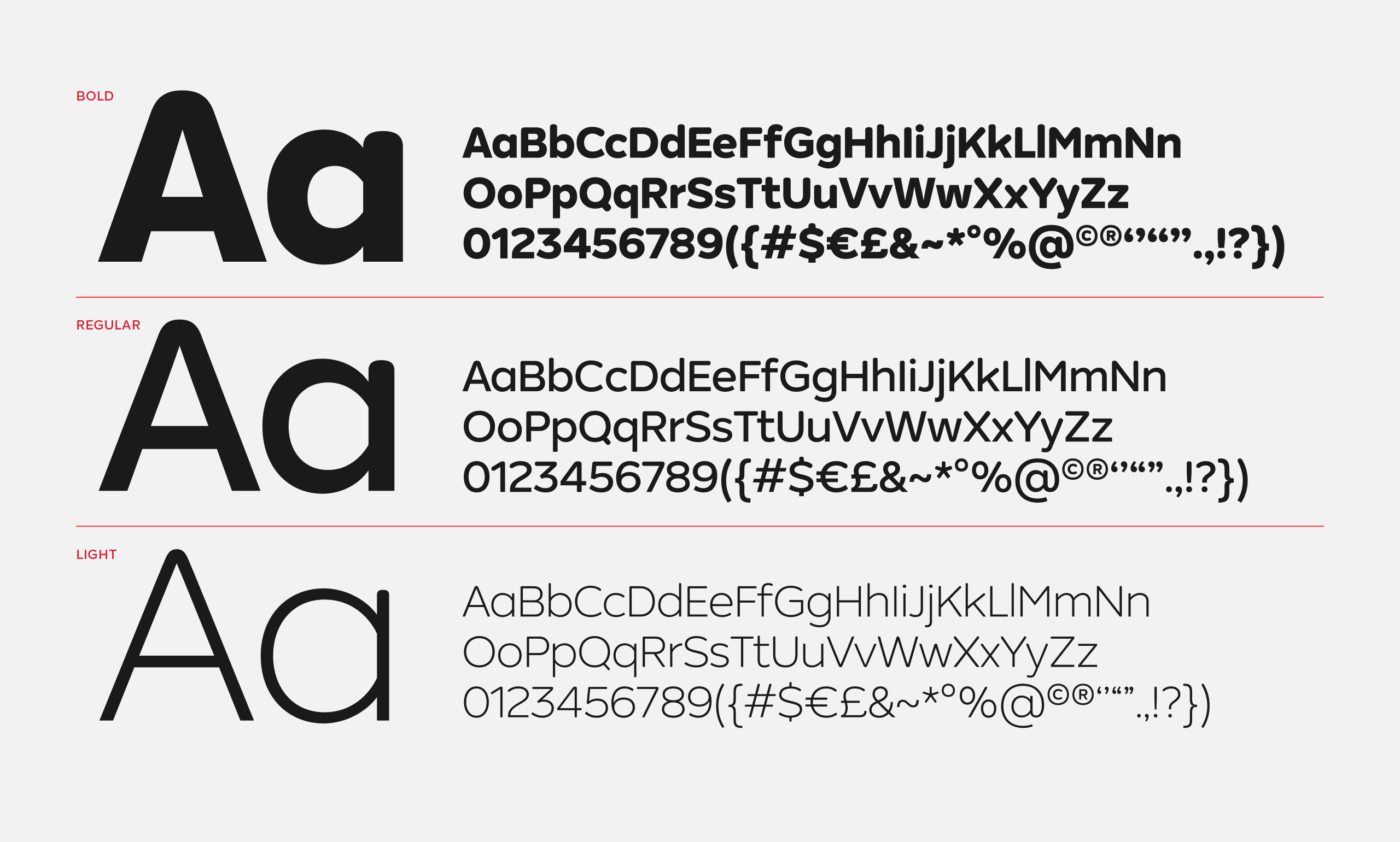
My role was to design a custom wordmark and sans-serif typeface, ‘Barrovian Sans’, in three weights. The brief for the typeface was firstly to reinforce the sentiment of ‘Barrow Rising’ – the core concept of the brand – while capturing a modern interpretation of industrial heritage. It needed a bit of ‘grit’, but without being too hard or rustic. It also had to work alongside the master ‘rise mark’. Read more about the project here.
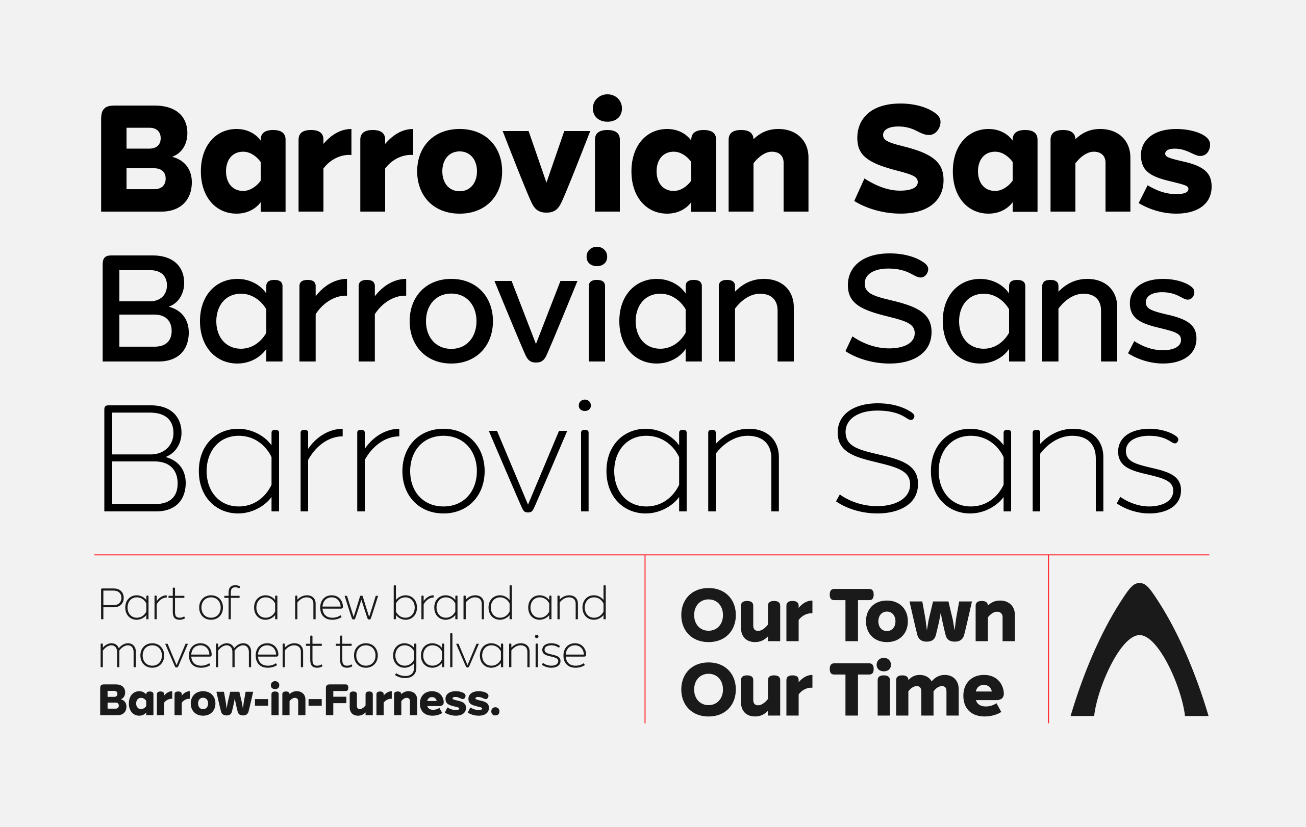
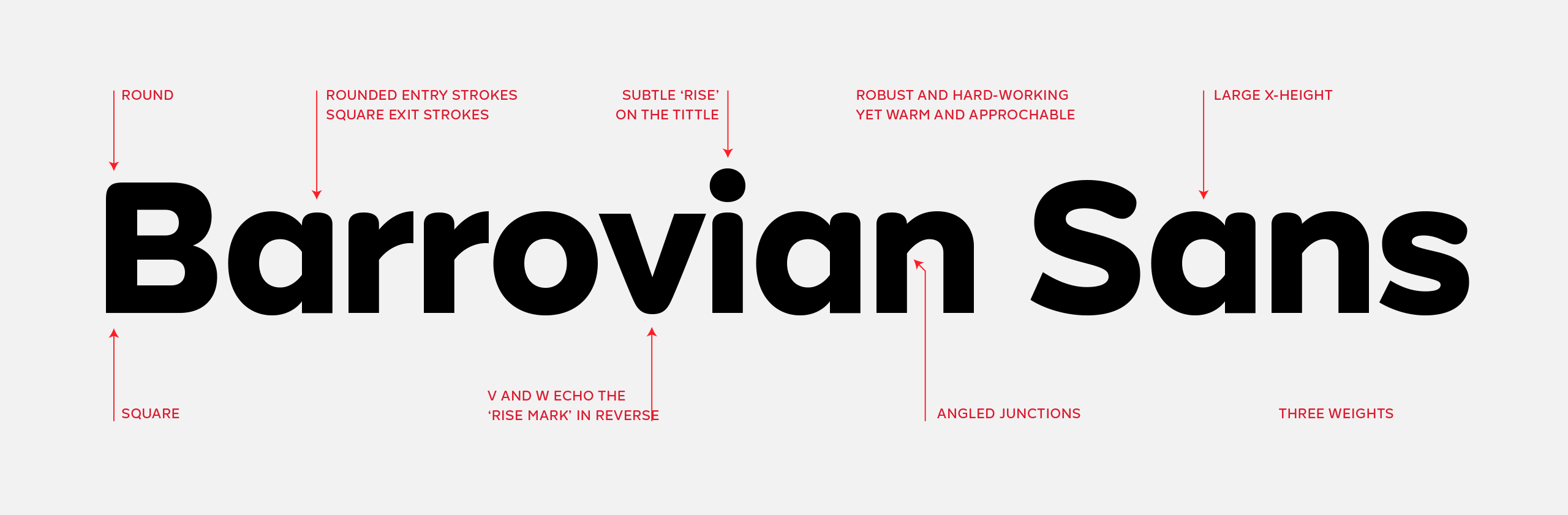
The wordmark was drawn in a custom weight with unique features and curves that borrow from the ‘rise mark’. Designed by Forepoint, the ‘rise mark’ is deeply rooted in Barrow’s heritage, drawing inspiration from the iconic bows of the submarines and ships built in the local shipyard and the elegant arches found in the town’s period architecture.