I was commissioned by Pearlfisher to help craft the wordmark and symbol as part of their rebrand for Sodastream. Sodastream is a brand I grew up with so I was delighted to be involved. Read more about the rebrand here.


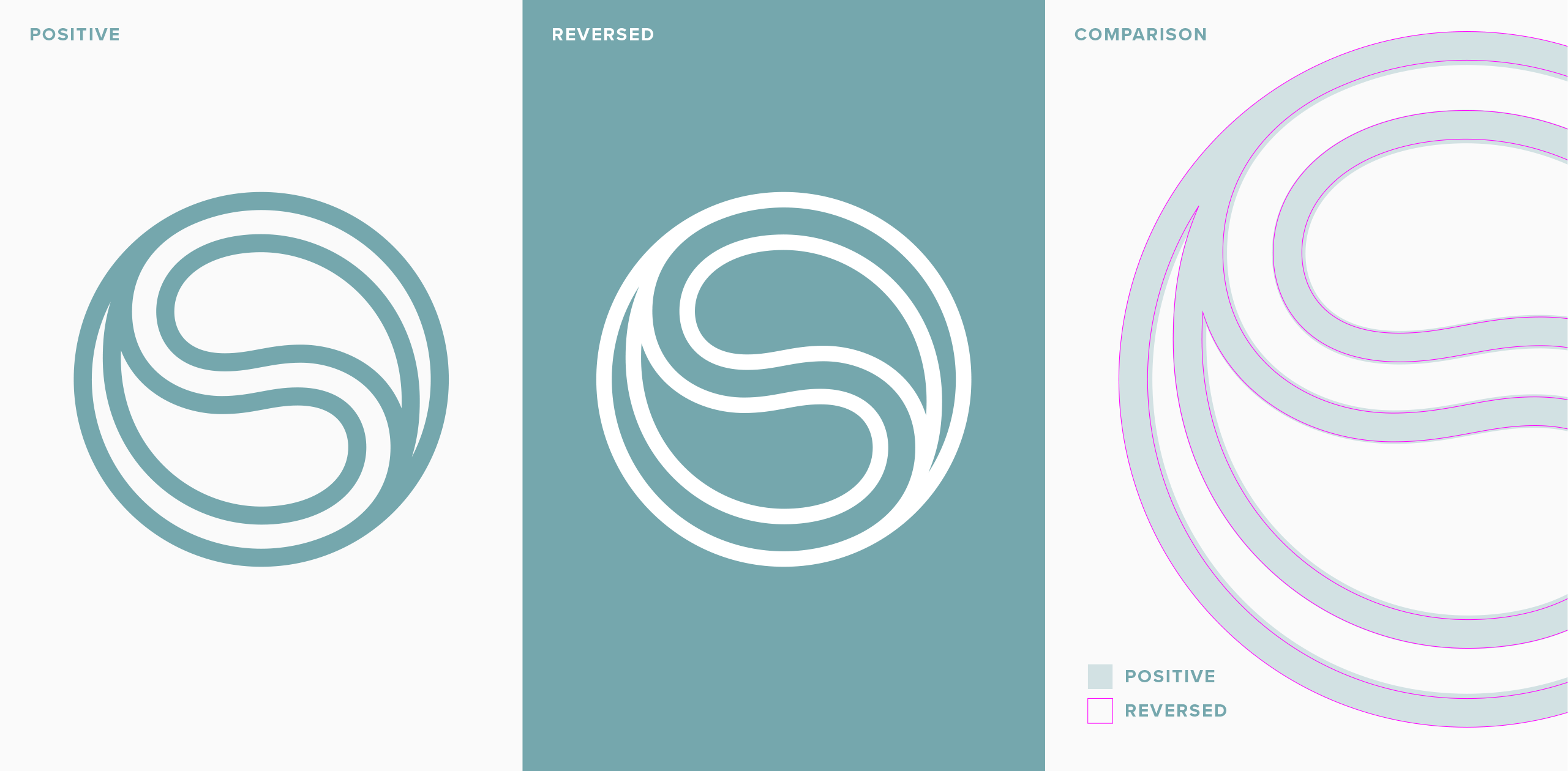
The new S symbol, designed by Pearlfisher, acts as the key graphic asset for the brand. At the heart of the symbol, two interlocking water droplets are arranged in a Yin and Yang formation to create a signature ‘S’ – depicting balance and harmony.
I was tasked with crafting and refining the symbol, and also ensuring it worked consistently well in both positive and reversed out scenarios. This required an additional lighter weight version to be created for optical consistency and to counter the ‘irradiation illusion‘, where lighter coloured graphics on dark backgrounds can appear bolder.
For the wordmark I was tasked with crafting and refining the type, based on Pearlfisher’s
bubble-inspired aesthetic using cleaner and rounder letterforms, evoking the feeling and taste of sparkling water.